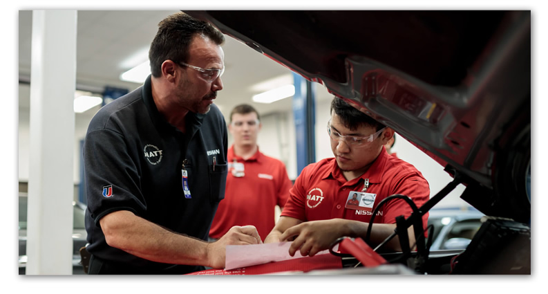
Service personnel in the field can show issues to specialists via video streaming
Specialists can use annotations to direct the camera or give instructions for a specific item on screen
Animated page transitions gradually shift the shape of the interface towards the final session layout
Summary
My Role: UX Designer for GoToAssist at Citrix Online
My Tasks:
Initial Research
Conceptual design
Prototyping
Visual design
Iconography & illustrations
Continuous improvements based on customer feedback
Platforms: Web (supporter side), iOS & Android (customer side)
Team: A product owner, four software engineers, an architect, a quality engineer, a UX researcher and a UX designer (me)
Process: Weekly Scrum sprints at first, later bi-weekly
Time: Proof of concept and future vision after a week, beta release after three months
System Usability Scale reached in User Tests: 82/100 (Industry average: 68)
Abstract: Seeit is about live video sharing for fast, effective onsite support. After you connect to a customer’s mobile device, you can help by talking via VoIP, and a live video is streamed directly to your web browser. You can pause the stream at any moment and place annotations on the image. Now it’s easy to direct the person, find the issues and assist in solving them.
I developed the user experience in an iterative process that involved alpha and beta version tests with employees at Nissan call centers and Sears Home Services. This regular stream of live customer feedback made it easy to improve on features and usability, and it also allowed to prioritize new features with ease.
Early usability tests indicated an already good experience right from the start: I used well-established interaction patterns and provided a clearly structured interface with animated page flow transitions for an added wow-factor. Together with the constant customer feedback, the product was soon well optimized and ready for the stores.
UX Process
The Beginning
Citrix Hack Week
In 2015, I joined a hackweek team that wanted to try out the new webRTC technology.
Since webRTC was all about live video streaming, and our IT support product GoToAssist was all about screen sharing, a mobile device camera sharing tool for real-world support szenarios was an obvious idea.
While the team developed a technical prototype, I spent the week with competitior research, interviews, discussions, creating flowcharts and UI designs to show a potential future vision for a comprehensive, marketable product that focused on the user needs.
The project was very well received, won a prize and got funded. Soon, a new team was formed to bring Seeit to the market, and I continued to take care of its UX design from then on.
Value Proposition
See what they see.
With video sharing, video annotations and VoIP, your customer’s problems are resolved much faster than just on the phone or via email.
This can save a lot of time and money for you and your customers, especially when it allows you to stay at your desk instead of a going on a trip to see the issue with your own eyes.
Research
Part 1: First User Interviews & Protoyping
When hack week started, I interviewed our co-located IT services and customer support agents about their “real world” tasks and needs. Then I discussed the product idea with them, presented a paper prototype and asked them what the app would need to provide in order to be useful in a support scenario.
Since we had personas and research data for one of our potential target customer groups already, I was able to deliver an initial vision for how the conceptual and visual design could be shaped at the end of the week.
After hack week was over, we showed the concept to some of our GoToAssist customers. Eventually, Citrix decided to market it as a new product in their support portfolio.
A beta version of Seeit was introduced to some chosen large enterprise customers to get feedback on performance and usability.
Part 2: Alpha version testing at Nissan’s call centers
Our sales department was able to establish connections to Nissan and their call centers, and they tried a very early version of the product with a dozen Nissan and Infinity dealerships.
Formerly, the dialog between agent and service worker was a constant back and forth of emails with image attachments, taking photos and phone calls until a tricky warranty issue was fully documented and clarified. They were very happy about the unexpected increase in productivity that Seeit provided.
The support agents and service workers gave us valuable feedback, e.g. about their documentation needs, which resulted in new features and flows that are useful in other industry sectors as well.
Part 3: Future Vision Design Prototype Creation & Testing
I met with the teams’ UX researcher and discussed the flows and features that needed testing.
Then, I built an interactive high-fidelity HTML prototype that covered these main flows and features.
The prototype even contained my planned animations and page transitions in order to deliver the full future vision experience.
The video on the left here shows a quick click-through through the prototype, not one of the actual test recordings.
Our UX researcher tested the main flows with users from our customer group and analyzed the videos afterwards. He also conducted a system usability scale assessment.
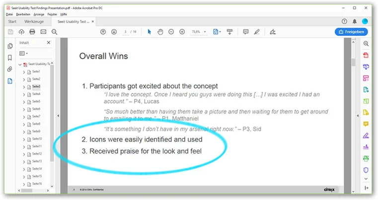
Observations and qualitative feedback suggested that the user experience was pretty good right from the start.
Of course, the tests still revealed some improvement potential that we considered in follow-up versions.
But all in all, the System Usability Scale assessment showed that the current usability of the product should be well above the industry average. That felt pretty good.
Part 4: Beta Version Tests at Sears
Sears Home Services helped us with testing the redesigned beta version.
The insights from this new business area helped us to make Seeit more productive in large enterprise scenarios.
They continued from beta to live versions and became a fan of the Seeit app:
„In my opinion, Seeit is the greatest innovation we had in Home Services since we gave laptops to our technicians decades ago.“
Conceptual Design
Design Principles
These core design principles for GoToAssist have been defined in one of our team workshops. They serve as our north star value set when creating new experiences for GoToAssist.
User Needs & Functional Specifications
The basic user needs have been collected in early interviews with IT support specialists in small to medium businesses.
Later on, we were able the refine our knowledge about what large enterprise service agents require when Sears and Nissan tested early versions of the product.
In the later phases, our researcher helped with organizing and filtering the feedback.
I used a Confluence wiki space to document, share and discuss my UX work.
I created UI-related Jira stories for the team that reflected the functional specifications, so that we could implement the different aspects of the product piece by piece.
When writing these stories, it was important for us that each story mentioned the related user need, so that everybody could grasp the main purpose of the implementation.
Interaction & Information Design
Our research confirmed that the actual video session was just a part within a bigger session flow that we should support from end to end:
Based on user needs and technical considerations, I created a flow diagram that shows the required UI’s, user flows, system decisions and connection points of the two apps. The visualization enabled the team to get on the same page quickly, and it also helped us to discuss the flow experience and what part we should focus on first.
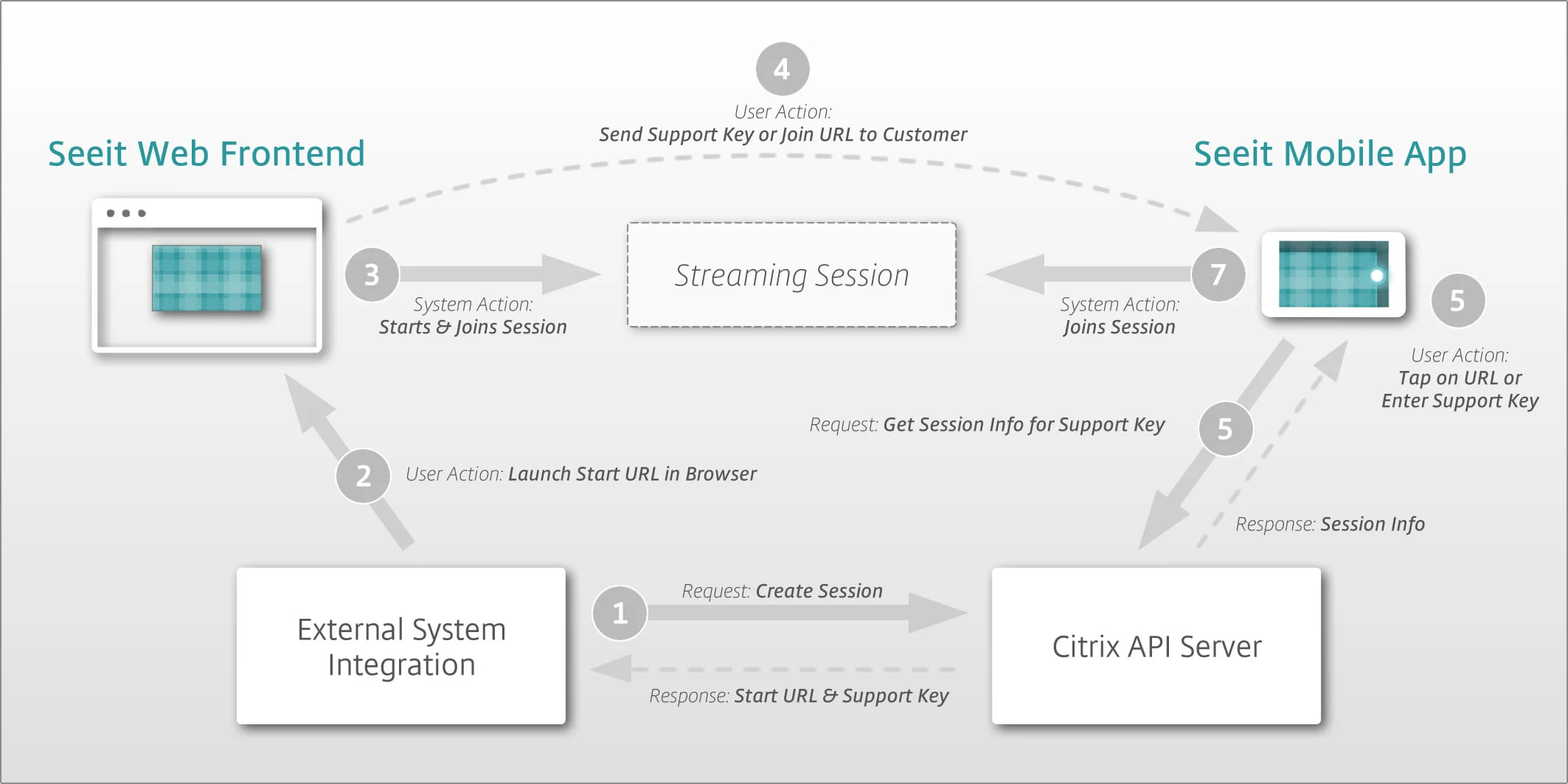
I also created a simple diagram that showed the interdependencies and flows of our systems when a session is created. That way, all stakeholders could easily see and discuss what’s going on underneath the hood, which again was important for the efficient collaboration with teams across different time zones.
Some initial wireframes and tests with internal IT staff during hack week showed that we can rely on established patterns of well known industry standards: camera apps and online video players.
However, I needed to alter the player concept a bit, since the different remote control functions and image sharing states were new concepts for the user, and they needed to be clearly identifiable.
For example, I supported a written status information in the “shared still image” mode by changing the color of the control bar and extending white photo paper borders from the shared image.
Visual Design
General Considerations
In order to design along our principles, the visual design should emphasize the content and stay out of the way in order to allow focus. This would call for a minimalist style, but then again, I also wanted to represent another principle, which was to give our customers something that they love to use. So, I decided to couple the richness of the visual design we had at Citrix with the expected cognitive load - when steps are easy, the visual design can be more playful.
The visual design can be vivid in some phases of the Seeit session, but should tone it down in others.
Design & Motion Concept
The main layers of the UI move upwards with each step of the session.
After some iterations and alignment with stakeholders, I presented a design concept that still used the elements from our global design library, but had some nice extras as well.
In addition to this standard set, I created a visually layered element approach that suggests subtle levels of depth, depending on hierarchical structure and importance. In addition, the basic motion design idea was about a white content page that gradually covers our GoToAssist brandmark background pattern - the more the user progresses through the three steps of the connection process, the more of the background is covered.
These extras helped to grasp the contents and flows even easier and made the experience feel modern and professional, which again added to the products stickiness.
Animated UI transitions support the flow in a progressive manner: the X pattern background becomes more and more covered by the main content area.
I used simple vector illustrations to support the status messages. They added visual clues to a problem or instruction, which allowed for a quicker and more intuitive understanding of what’s going on.
When envisioning the email messaging, I had to work with many technical constraints.
I also created image assets for web, iOS and Android, as well as the respective store images.
Hi-Fidelity Mockups


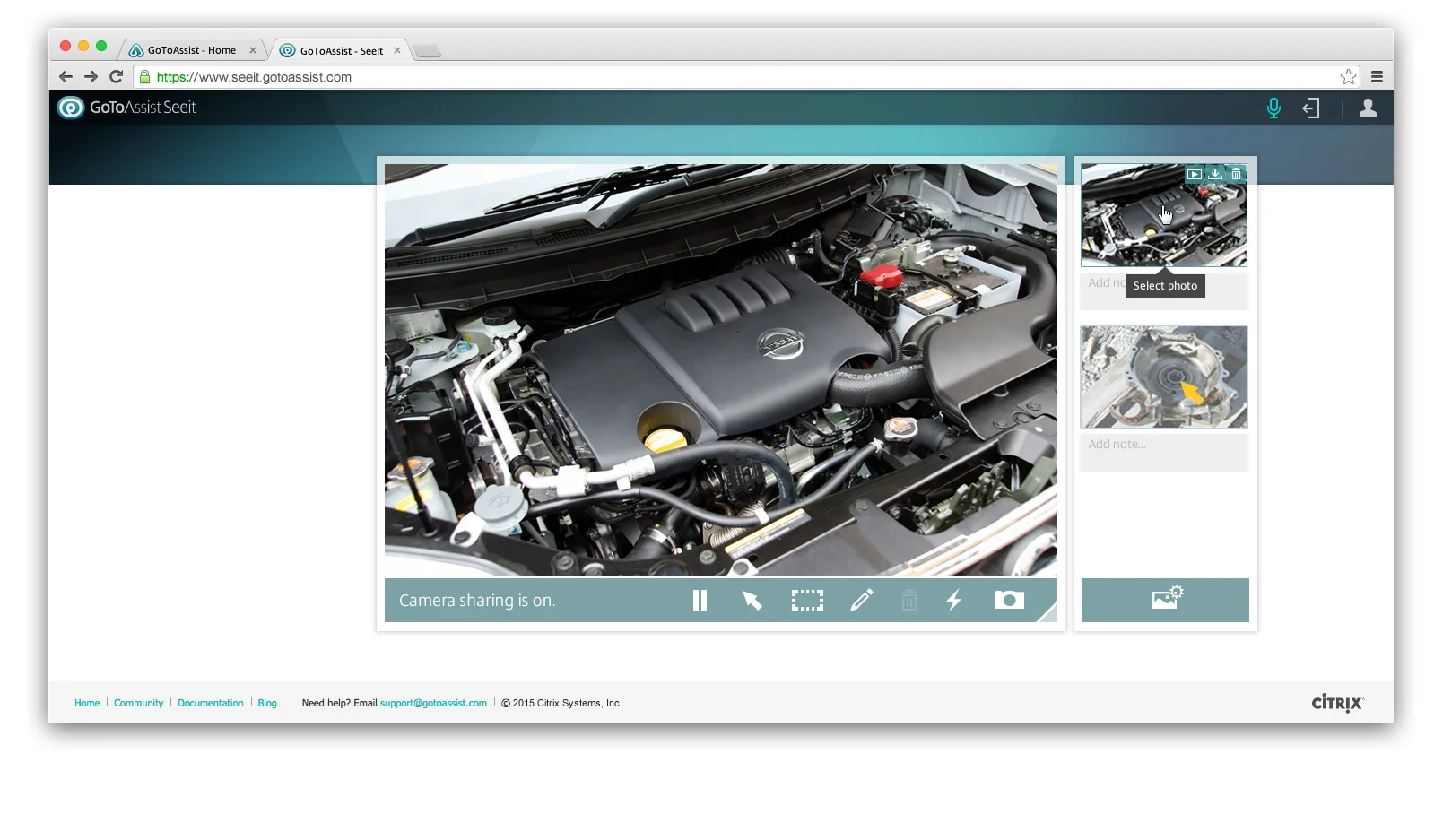


Future Technology Pitch:
Leap Motion for Seeit
Value Proposition
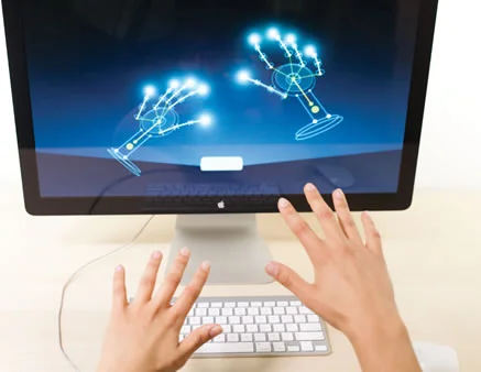
When I first heard of Leap Motion and saw its magic gesture tracking abilities, I immediately felt that it had great potential for support agents using Seeit. So I explored the idea and presented it to stakeholders and colleagues.
The basic idea is simple: just use gestures and your voice to give instructions on issues shown to you in a video stream.
This would be a big advance in terms of intuitive usage and product simplicity, and no competitor has something comparable yet! No more detours via static arrows and scribbles - just the intuitive use of hands would guide customers towards the solution to their problem.
And Leap Motion wouldn’t just only save time and cognitive load in the support scenario, it would also be pretty desirable:
During my time as a designer for IT support products, I learned that support agents draw quite some satisfaction from being able to help their customers with advanced remote control and screen sharing tools like GoToAssist. Their customers often tell them that it was a magical experience when an agent accessed their computer and fixed a problem instantly.
When they tell you this, you can feel that they like being in the role of the “Good Wizard”, and Leap Motion could add a lot of impressive magic spells to their portfolio.
In addition, most IT support agents have a weakness for new techy gadgets, and many share the fascination for next-level UI’s like shown in “Minority Report” or the similar movies.
So, a Leap Motion integration into Seeit might be very attractive for them just because of its raw awesomness factor.


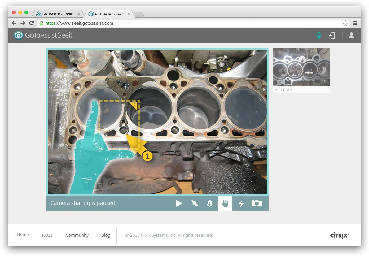


Leap Motion Usage Scenarios
There’s a large variety of hand gestures that can support what the agents try to explain to their customers - hands are one of primal body language components, especially when it comes to explaining things.
Apart from these human-to-human interactions, hand gestures could be also used to control the app itself, and that could result in a quite magical user experience for the support agent… here are some sketches on how that could look like:
What happened to Seeit?
Seeit was a big success for Sears:
The field service technicians' productivity and job satisfaction has increased,
Their time spent on an average site visit has gone down by 40 minutes.
20% decrease in the number of appliances that Sears has to replace because repairs would be too complex.
This results in multi-million dollar savings for Sears Home Services.
The leap motion idea was well received, but in the end, the return on investment didn’t seem to be promising.
Seeit is still available (https://get.gotoassist.com/seeit) and continues to solve problems for companies around the world, for example Endress + Hauser


